CardX Thailand
2024
Role
Product Design Intern
Duration
JUL - AUG 2024
Skills
User Experience
Team
Brand solutions


Overview
This past summer, I had the privilege of interning at CardX, where I worked as a Product Design Intern. Collaborating closely with the Brand Solutions and Consumer Platforms team of the Marketing Department, my primary responsibility was to enhance the user flow, structure, and interface of CardX's credit card promotions page on their website by leveraging data optimization.
Problem
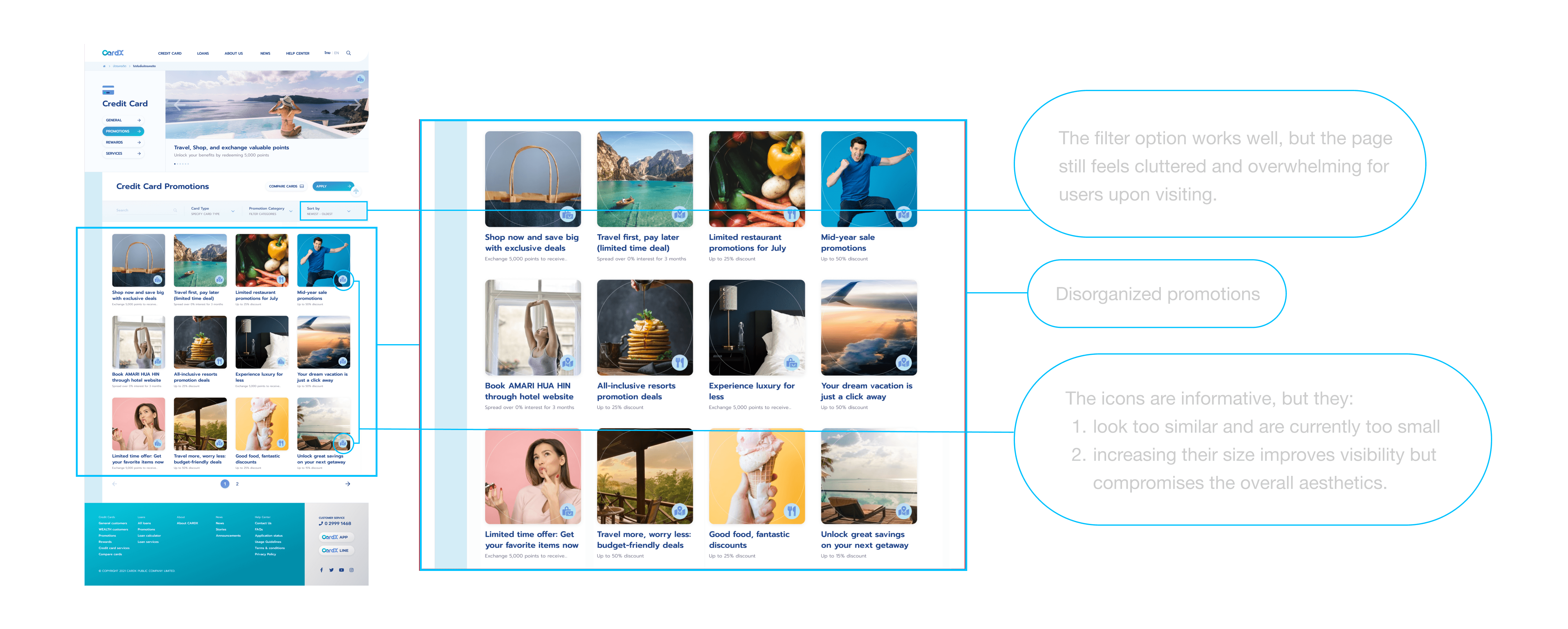
CardX's credit card promotions page hosts a diverse range of categories, yet its current layout lacks efficient organization, presenting promotions of all categories in a jumble when visitors visit the page. This disorganization hinders user experience and website traffic flow.
Product Goals
The goal was to create a more organized and user-friendly presentation of promotion categories, enabling visitors to easily navigate and find the deals most relevant to them, ultimately improving user engagement and enhancing the online experience for CardX's customers.
Solution
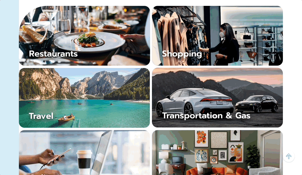
To address this issue, I came up with a solution to implement a dedicated promotions category page. Users will be able to select their promotion preferences from this page before the promotion cards are displayed.
Quantitative Research
I started by conducting research on the existing data, utilizing a web analytics tool to identify which categories received the highest traffic (shown below).
By adopting a customer-first approach, these insights guided future design decisions, ensuring a more user-centered and intuitive interface.
01 Restaurant
Views
Total Users
New Users
Active Users
468.1%
551.5%
724.6%
550.1%
5,948
5.4K
3.9K
4.5K
02 Shopping
Views
Total Users
New Users
Active Users
-44.9%
-49.7%
-51.4%
-50.9%
6,436
4.5K
3.1K
3.8K
03 Other
Views
Total Users
New Users
Active Users
346.3%
371.4%
643.7%
392.0%
4,177
3.7K
2.8K
3.3K
04 Travel
Views
Total Users
New Users
Active Users
-75.3%
-77.3%
-80.8%
-78.7%
3,223
2.4K
1.6K
2.1K
05 Car & Gas
Views
Total Users
New Users
Active Users
-6.0%
-2.9%
11.7%
2.7%
1,310
1.0K
642
850
06 Events & Concerts
Views
Total Users
New Users
Active Users
-33.5%
-39.9%
-50.6%
-45.0%
1,102
814
435
658
07 Online
Views
Total Users
New Users
Active Users
-70.7%
-69.0%
-67.4%
-69.8%
928
775
425
604
08 Home & Furniture
Views
Total Users
New Users
Active Users
-73.6%
-75.4%
-83.8%
-77.5%
472
380
158
297
09 Supermarket
Views
Total Users
New Users
Active Users
5.9%
13.3%
19.0%
5.8%
307
247
119
183
10 Entertainment & Gadgets
Views
Total Users
New Users
Active Users
-98.3%
-98.5%
-99.4
-98.6
168
131
43
110
11 Beauty & Health
Views
Total Users
New Users
Active Users
-57.9%
-63.6%
-54.7%
-59.0%
64
52
24
50
Information Architecture
Using the obtained page traffic statistics, I planned to display the promotion categories in order of popularity, from the most favored to the least favored among users.
Strategy Checkpoint
Solution
But wouldn't that further affect the
visibility of less visited categories?
To tackle this issue, I proposed the idea of
showcasing newly added, trending, or
soon-to-expire promotions from all categories
ahead of the promotion category listings.
This section will undergo regular updates to
keep users well-informed about the major deals
all promotion types offer.
Product Thinking
The Design Process
Brainstorm, Design, Iterate, Repeat.
Wireframing & Prototyping
With several structural ideas in mind, I began by designing low-fidelity wireframes to organize and test out the layout and structure of the categories (left).
After refining the structures, I incorporated the content provided to me to create high-fidelity wireframes, focusing on visual hierarchy, typography, and customer interaction to ensure a seamless and intuitive experience (right).


A/B Testing
I met with my manager and the brand solutions team to assess the various prototype iterations I had developed. By conducting A/B testing, we collectively determined that one specific prototype stood out as the preferred choice. This decision factored in consideration of a mobile interface as well.
Version A
The square-shaped boxes occupied too
much space on the page, impairing the
user experience when it came to efficient
navigation and category access.
This deficiency in the web version also
raised concerns about its compatibility
for the mobile version, leading to the
elimination of A.


Version B
Although B was visually clean and appealing,
the page's excessive length negatively
impacted the user experience by requiring
too much scrolling time.
These issues would carry over to the
mobile version, making it an inefficient choice.

Version C
C emerged as the winning choice for its
combination of a clean design, efficient
performance, and mobile compatibility.
The Final Flow
Customers start by browsing the category
page, where they can view all available
categories. From there, they can select a
category to further explore.
Next Steps
With the CMO of CardX having given their approval for my designs, the next steps involve forthcoming discussions of implementing the design on the official website with the development team.
Key Takeaways
Framer 2023
Amsterdam